The Brief
To make this comparison honest, the brief had to be real — not vague, not artificially easy for AI, and not artificially hard for humans. Here's exactly what both sides received:
🤖 The AI Attempt
What the AI was asked to do
We used Midjourney v7 for the icon exploration (visual concept generation) and Ideogram 2.0 for the full wordmark attempts, since Ideogram handles text-in-image significantly better than Midjourney. No Photoshop. No Illustrator. AI output only — the rule was that the human couldn't touch it up.
Generated 4 batches (16 options). The best three were upscaled and tested at 32px. Two held up well at small sizes. The geometric options were stronger than the lettermark attempts — Midjourney still struggles with letter-specific icons that don't look generic.
Ideogram produced surprisingly legible text — the letter spacing and weight felt intentional. But the font wasn't editable. Every variation was a raster PNG. To export an SVG, we'd need to manually trace it or find a matching commercial font — which crosses into human work. We noted this as a significant limitation.
The SVG output from AI+vectorizer was functional but not production-clean. Nodes were messy, stray paths existed, and the light-background variant required manual color inversion. At this point, we'd spent 2h 45min on active work. The SVG technically "worked" but would need cleanup before handing to a developer.
The AI output — honest assessment
The icon was genuinely good. Clean, geometric, scalable. If you saw it on a real product, you wouldn't immediately think "AI-made." The wordmark was the weak point — the font couldn't be licensed, exported cleanly, or modified without additional human work. The color variants worked but required manual cleanup. Total production-ready status: about 60%. The remaining 40% needed a human to finish.
AI image generators produce raster PNGs, not vector SVGs. Converting to production-ready SVG (the only format clients actually need for logos) requires vectorization software + manual cleanup. Factor this in. It took 40 minutes just on that step — nearly a quarter of the total time budget.
🧑 The Human Attempt
The human's process
Our freelancer read the brief, asked two clarifying questions (which industry analogues to look at, and whether animation was needed for the icon), then spent 30 minutes on a mood board before opening Figma. The questions alone were telling — AI never asked a single one.
The orbit concept (representing neural connections, also playing on "Nova" as a star) was selected as the primary direction after a quick gut check. This conceptual thinking — understanding that "Nova" implies astronomy and "Mind" implies cognition, then merging both — is something the AI never approached. Midjourney gave us generic tech icons.
The icon was built from scratch using Figma's pen tool and boolean operations. It came out as a production-ready SVG immediately — no conversion step needed. The designer built 4 variants (dark logo, light logo, icon-only dark, icon-only light) and set up a Figma component library with color tokens, so future brand updates would be trivial.
The final package included a one-page brand reference (minimum size, clear space, incorrect usage examples). This wasn't in the brief — the designer just did it because it's standard practice. AI gave us files. Human gave us a brand system.
The human output — honest assessment
The logo had a concept behind it. The orbit/neural-connection motif actually meant something. It was export-ready immediately in every format needed, with a proper brand mini-guide attached. The font was commercially licensed and editable. The whole package would survive handing to a developer, a print shop, or a social media manager without anyone needing to ask follow-up questions. Total production-ready status: 100%.
📊 The Scorecard
Five metrics. Scored 1–10. Every score has a reason — no arbitrary numbers. The metric weights reflect what actually matters when you're building a real brand.
🏆 The Honest Verdict
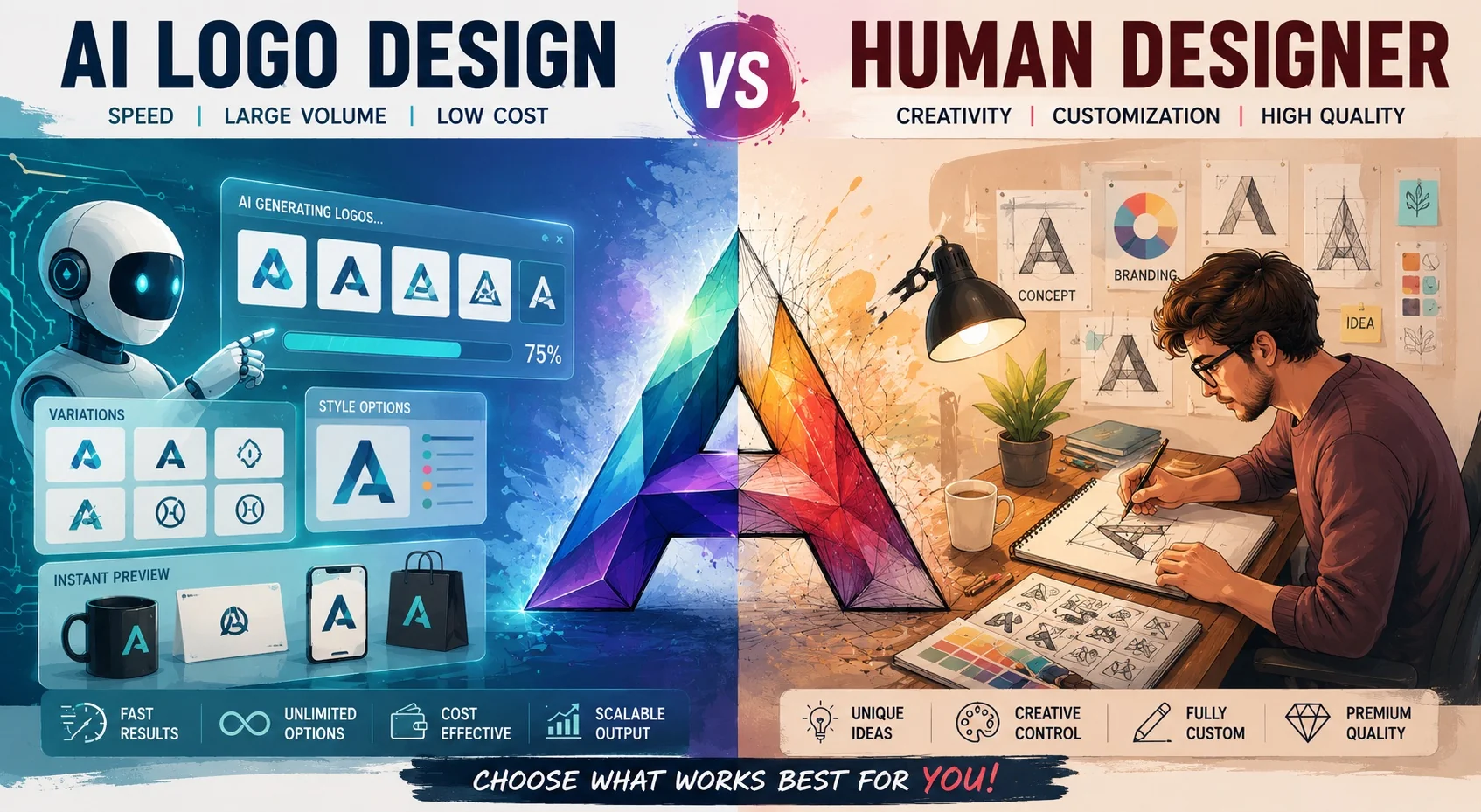
If your only metric is cost or speed-to-first-draft, AI wins decisively. For $10 and ~45 minutes of prompting, you can generate a set of icon options that look professional enough to test with users. That's genuinely valuable for pre-seed startups, side projects, or anyone validating an idea before investing in real design.
But if you need a logo that will live on your product, your pitch deck, and your business card for the next 3 years — the human delivered something fundamentally different in kind, not just quality. The orbit/neural concept meant something. The SVG was clean. The brand mini-guide meant the designer thought beyond the deliverable. AI gave us files; the human gave us a brand system.
The score is 39 vs 32, but the real gap is in versatility (10 vs 4). That single metric is the one that costs you later — when you need to resize, recolor, animate, or hand the asset to a developer who has questions you can't answer because the file is a traced raster PNG.
🔀 The Hybrid Approach (Recommended)
Use AI for exploration, human for execution
The optimal workflow isn't AI instead of designer — it's AI before designer. Here's the exact process:
Estimated hybrid cost: ~$75–90 (vs $135 human-only or $10 AI-only). Estimated hybrid quality: 95% of human-only, 160% of AI-only. This is the workflow we'd use for any real project.
When to use each approach
- You're pre-revenue and can't spend $100+
- You need something for a landing page A/B test
- You're exploring 10 business ideas in a week
- The logo is internal-only or for a temp project
- You want to narrow visual direction before hiring
- This logo will be on your product for 2+ years
- You need clean SVG for print, merch, or animation
- Brand concept and meaning matter to you
- You'll be handing the file to developers or print shops
- You want a brand system, not just a file
The bottom line
AI logo tools in 2026 are genuinely impressive for exploration and iteration. Ideogram's text rendering has crossed a threshold where wordmarks look intentional rather than accidental. Midjourney's icon options are often indistinguishable from stock icon packs. For $10/month, that's remarkable.
But the gap between "looks like a logo" and "is a logo" is still wide. Production-ready SVG, commercial font licensing, editable vectors, brand system thinking — these are still things that require a human. The AI output was 60% done. Getting from 60% to 100% required human time anyway, which eroded the cost advantage significantly.
If you're at the "validate the idea" stage: use AI. If you're at the "build the brand" stage: hire a designer — but use AI first to cut their time in half. That's the honest answer.